
 |
|---|
DEFINING THE GAP BETWEEN CULTURE, ART & DESIGN.

PINKRIKSHAW C/O HAJRA TARIQ
I am a creative (born and raised in Lahore, Pakistan, lived in Kuala Lumpur, London, Florence and Dubai), currently based in Berlin. Working at the intersection of digital design and brand identity I've had the privilege of working with clients from around the globe starting from the initial brand strategy phase to the final design and production of a project. I aim to redefine the relationship of culture, art and design between beings and brands.
I specialise in art direction and digital development; concepting, design, photography, merchandise and production across all media platforms.
Full bio here.
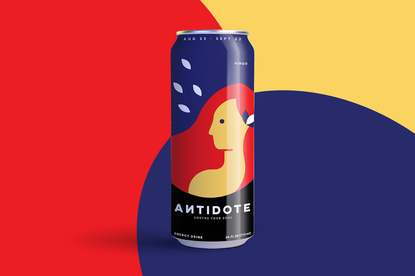
ART DIRECTION / PACKAGING DESIGN
Antidote - An energy drink with an easy-to-remember brand name and distinct flavours based on your horoscope.
■ PROJECT: ANTIDOTE ENEGRY DRINK
■ ROLE: ART DIRECTOR & DESIGNER
■ DATE: 2019
Designed specifically to fit every individuals personality trait according to their zodiac sign, which presents an interesting and more personalised alternative to a market flooded caffeine based energy drinks.
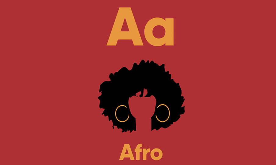
ART DIRECTION / PACKAGING DESIGN / DIGITAL ILLUSTRATIONS
The ABCs of BLM - These flashcards help teach children about the beauty and importance of diversity from an early age.
■ PROJECT: ABCs of BLM
■ ROLE: ART DIRECTOR & DESIGNER
■ DATE: 2020
The ABCs of #BLM uses phonics to create positive associations with people of color. By replacing words like “apple” with “afro”, our goal is to help teach children about the beauty and importance of diversity from an early age.
ART DIRECTION
Stunts Behind The Stall - Bringing life back to the foodstalls in Bangkok during covid.
■ PROJECT: STUNTS BEHIND THE STALL
■ ROLE: ART DIRECTOR & DESIGNER
■ DATE: 2021
Yaowarat Road, was the beating heart of street food in Bangkok before Covid. With zero budget we decided to bring back it back to life. We discovered that after years of practice they're not just making food they are throwing the best show in town.

ART DIRECTION
The Day T(rans) Goes Invisible - This PR stunt helps make the presence of Black Trans people visible, by making them invisible, literally.
■ PROJECT: THE DAY T(RANS) GOES INVISILBLE
■ ROLE: ART DIRECTOR & DESIGNER
■ DATE: 2020
Mainstream LGBTQ groups solely focus on fighting for the rights of white L(esbian), G(ay), B(isexual) and (Q)ueer, and at no point have Black Trans people shared fully in the gains of racial justice from the activism.
In LGBTQ, T stands for Transgender, meaning it stands for the most overlooked group of this activism.


ART DIRECTION / PACKAGING DESIGN
AfroFuturism Playing Cards - These cards help reimagining a future filled with arts, science and technology seen through a black lens.
■ PROJECT: AFROFUTURISM PLAYING CARDS
■ ROLE: ART DIRECTOR & DESIGNER
■ DATE: 2019
Focusing on African diaspora, these cards feature a completely custom design in a typical Afro cultured style which can be described as minimal, modern, graphic, delightful and just plain African.

ART DIRECTION / PACKAGING DESIGN / DIGITAL ILLUSTRATIONS
Antidote - An energy drink with an easy-to-remember brand name and its distinct flavours based on your horoscope.
■ PROJECT: ANTIDOTE ENEGRY DRINK
■ ROLE: ART DIRECTOR & DESIGNER
■ DATE: 2019
Designed specifically to fit every individuals personality trait according to their zodiac sign, which presents an interesting and more personalised alternative to a market flooded in caffeine based energy drinks.

ART DIRECTION / BRANDING & IDENTITY
After8 - A celebration with a collection of events, concerts, parties and fury.
■ PROJECT: AFTER8
■ ROLE: ART DIRECTOR & DESIGNER
■ DATE: 2019
It's <AFTER> + <8> meaning everything starts After8. Branding and identity of the complete event.

ART DIRECTION / EDITORIAL DESIGN / DIGITAL ILLUSTRATIONS
The Book That Wanders - A DIY postcard card book focusing on Lahore in its true spirits.
■ PROJECT: THE BOOK THAT WANDERS
■ ROLE: ART DIRECTOR & DESIGNER
■ DATE: 2020
Books have the same allure of discovery as travelling. Turning postcards into a book and allowing consumers a DIY element helps create this interactive souvenir.